Proposal Form
A proposal submission form for a crowdfunding platform.
| Space: | Education, Crowdfunding | |
| Roles: | User Research, Content Strategy, User Testing | |
| Challenge: | Lower the barriers to entry for educators to submit crowdfunding proposals. | |
| Outcome: | Using a story-forward content strategy, we developed an efficient, natural language form. | |
| Methods: | Comparative Analysis, Interviews, Content Strategy, Prototyping | |
| Collaborators: | Eva Hu, Ludi Dai, Srujana Puttreddy |
TABLE OF CONTENTS
1. Comparative Analysis
2. Interviews
3. Content Strategy
4. Lo-Fidelity Prototypes
5. User Testing
6. Research Summary
7. Design Brief, Update
DOCUMENTS
Research Questions for Users (pdf)
Research & Content Insights Report (pdf)
Content Manual (pdf)
INTRODUCTION
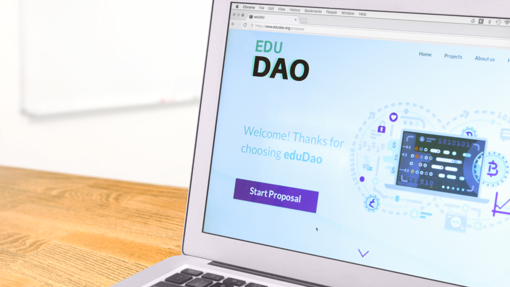
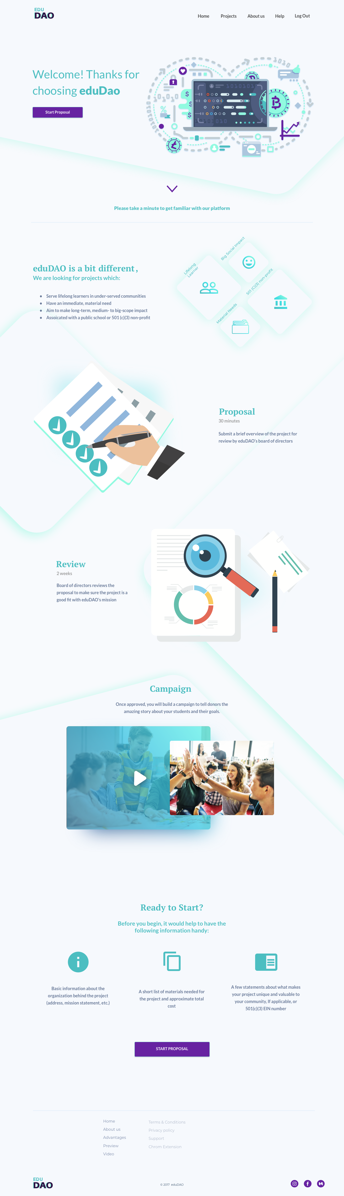
This case study presents a comprehensive UX project my team and I completed for EduDAO - a crowdfunding platform for educators. The organization's aim is to help teachers develop projects for classrooms, schools, and non-profits.
Entering a tight marketplace of crowdfunding platforms, eduDAO is attempting to differentiate itself with a blockchain-based payment and goods tracking system as well as the additional benefit of very low processing fees.
Our team took on the design of the platform's proposal submission experience.
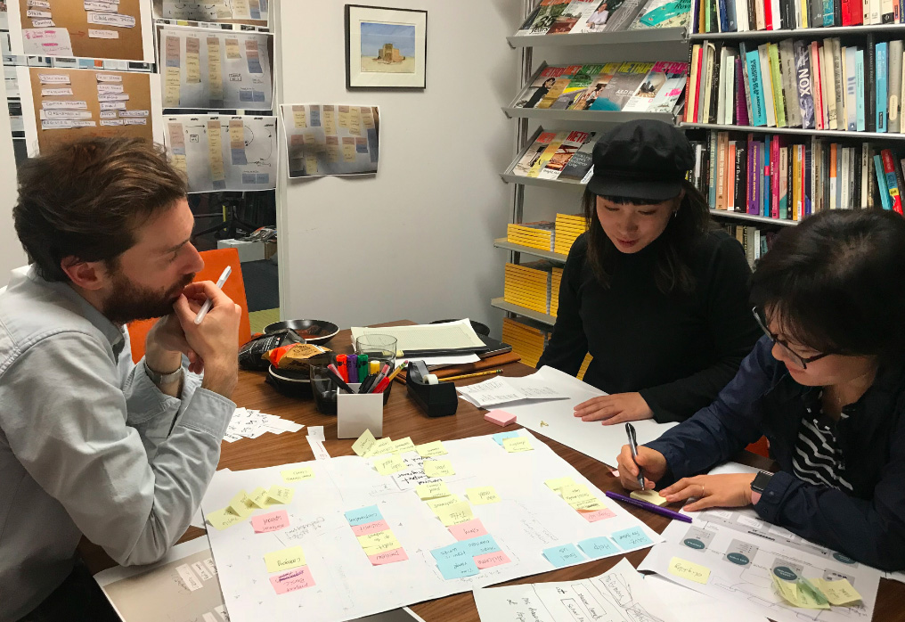
Our team, at a late-night work session.
The purpose of the proposal experience is to collect information from educators about their projects. At this point our brief appeared as:
Initial Design Brief:
Design a standard form which guides users through the proposal submission process.
The following case-study describes how my team and I approached and resolved this brief, ultimately leading to documentation for a UI.
RESEARCH
On the face of it, the project seemed straight forward. But actually, most forms, whether online or on paper, are anything but simple and are notoriously frustrating for users. This kind of user predisposition makes designing a good form a particular challenge.
Going into the research phase, we identified 3 challenge areas - Content (collecting the right information), Context (why the information is being collected), and Presentation (how this process is presented to users) - along with the following presumptions about the solution:
- Content: Users want to get through the proposal application as quickly as possible.
- Context: The user's main objective is to obtain the materials which they are requesting in their proposal.
- Presentation: Educators are generally familiar with and will understand how to navigate crowdfunding platforms.
With these 3 presumptions apparent, we set out to check for their validity through a series of research and development methods:
1. Comparative Analysis
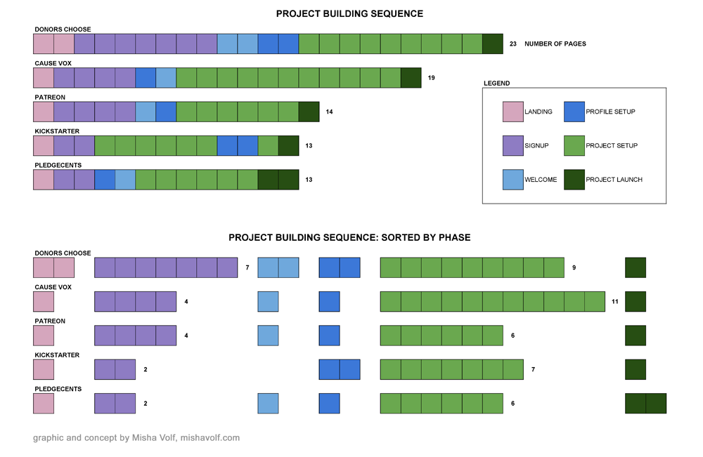
The Page-By method presents an easy graphic comparison between the experiences of multiple competitor platforms.
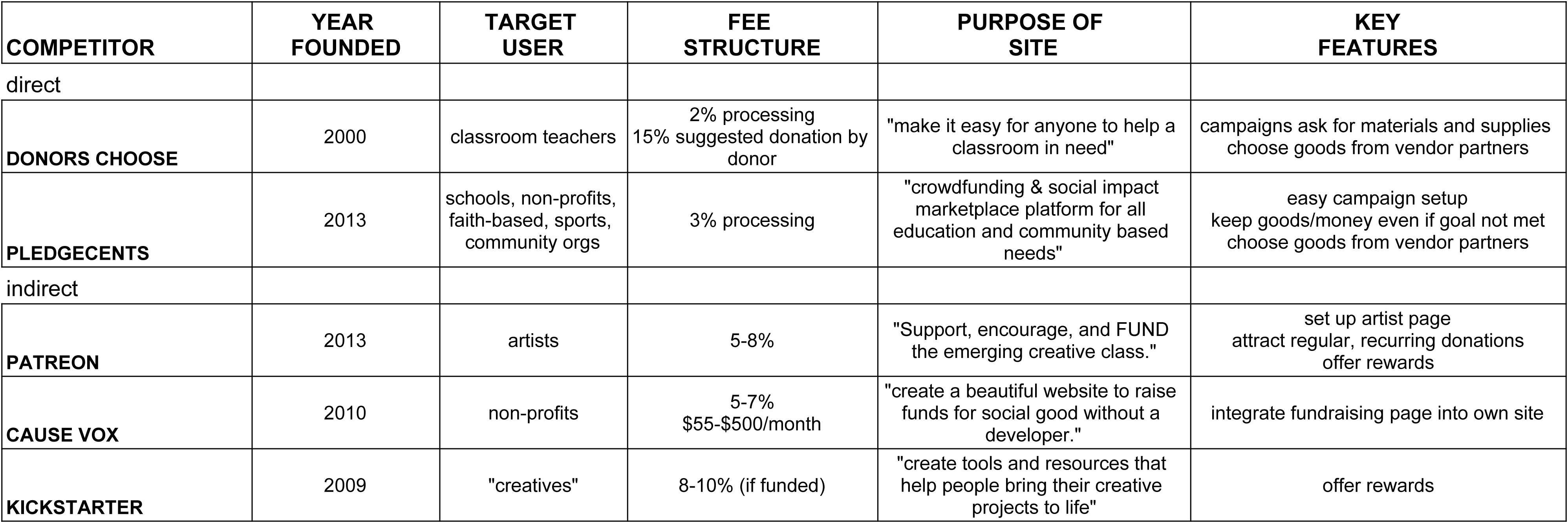
We analyzed 5 crowdfunding platforms, 2 of which - Donors Choose and Pledge Cents - were direct competitors.
Analysis showed that competition in this space is tight, and Donors Choose is a well-established leader. However, we also discovered that through a low pricing structure and an outstanding user experience, eduDAO can potentially gain leverage.
Crowdfunding platforms targeting diverse needs and communities have proliferated. This is especially true in the non-profit, education sector. Understanding who the players are in this field, and how they've engaged their communities, is important towards developing a solution for which there is a real need.
Summary of Comparative Analysis Vitals.
Along with the assessment of competitor's "vitals" (as seen in the table above), we also reviewed each competitor's campaign building flow. Using the Page-By method (see the Appendix), we compared the number of steps required to go "page-by-page," in order to post a viable crowd-funding campaign on each platform.
Key Takeaways:
- Donors Choose has the most similar premise to the one pursued by eduDAO: vendor-based materials procurement.
- Donors Choose is also the most formidable competitor. This website has a substantial user base and much credibility among teachers. For eduDAO to succeed, differentiating itself from Donors Choose must be a primary strategic objective.
- Donors Choose also happens to have the longest, most complicated, and most disjointed experience. This is a competitive opportunity where UX can make a big difference for eduDAO.
- All competitors charge a payment processing fee of ~3%. This is an opportunity for eduDAO, which, leveraging blockchain technology, will only charge users 0.5% fees.
- Pledgecents and Kickstarter have the shortest sequence without sacrificing much content.
- Donors Choose has many useful features worth adopting (e.g. tips on how to make the campaign more compelling):
An internal question sort in preparation for the exploratory user interviews.
Having familiarized ourselves with the marketplace and the product type, we went on to learn more about our potential users and to begin in/validating our presumptions. We conducted interviews with 6 educators.
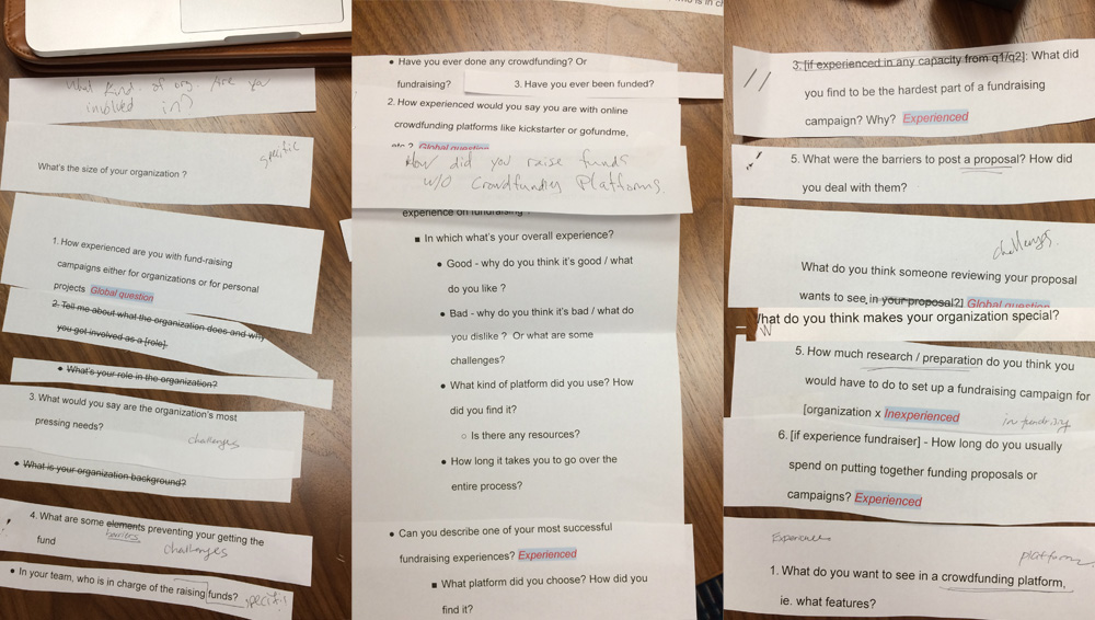
In preparing for the interviews, we developed a comprehensive Questions Rubric.
Key Takeaways:
- Potential users generally fell into one of two personas: Public School Teacher, or Non-Profit Organization Founder.
- Both groups emphasized the importance of being able to tell a compelling story about their projects.
- Users generally expected to spend several hours putting together a campaign.
The interviewees included teachers presently and formerly working in public schools, as well as leaders at non-profit educational organizations who operate either in partnership or independently from the public school system.
These initial interviews were semi-structured and exploratory. The aim of the interviews was to discover users':
- goals and needs in regards to crowdfunding generally
- experience with building crowdfunding campaigns specifically
The interviews focused on 3 key areas including:
- user's general background, position, and role within the education space
- experience with crowdfunding platforms
- proposal writing and funding campaign development
Additionally, we were interested in educators' ability to effectively present their projects to eduDAO's Board of Directors. Through conversations with stakeholders, we knew that the Board was seeking projects that not only helped under-resourced students, but also, to some extent, addressed systemic socio-economic disparities.
Excerpts from Interviews:
On developing a story:
"People are more likely to give, and more likely to give more, if their emotions are tapped by story"
On effort required:
"To get it going, I'd say 5-10 hours."
On teacher workload:
"Teachers are super stressed and super busy."
For additional audio excerpts, see the Appendix.
Personas:
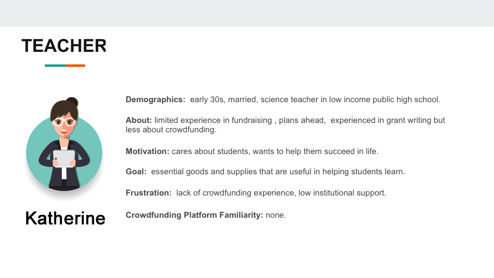
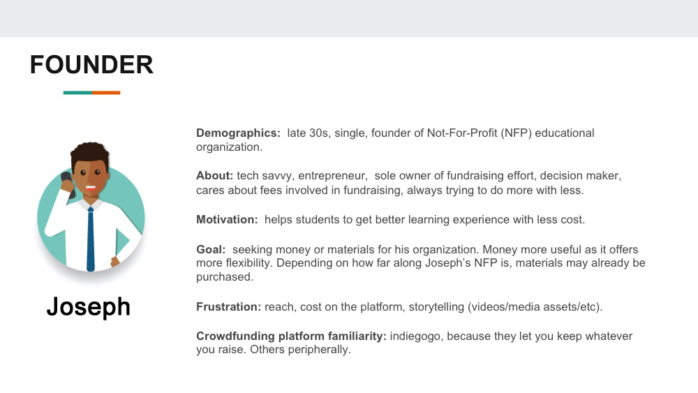
Among other findings, the interviews revealed that educators fall into one of two relevant Personas:
1. Teachers who work in public schools:
- very time-poor and often do not have the resources to develop extensive crowdfunding campaigns
- less familiar with crowdfunding platforms
2. Founders of Not For Profit (NFP) organizations that are leading educational initiatives:
- much more tech and media savvy (though experience with crowdfunding is still limited)
- used to devoting resources to the effort of communicating their organization's mission
With an understanding of users' goals, we moved on to identify precisely which pieces of information were essential to collect at this point in the eduDAO experience.
Since users identified telling a compelling story as a major painpoint, we set out to develop a story-forward information collection strategy, which would prompt users to begin recognizing the stories in their own projects.
This line of thinking ultimately led to the development of the Content Strategy Report:
To consider the different ways of organizing application content modules, we conducted a lo-fidelity internal card-sorting exercise.
In arranging these structures, we initially treated vertical placement within each section as the priority dimension (modules placed higher were deemed more important).
In fact, according to the "Attention Decrement Hypothesis" (see Appendix), in general, content modules that are placed earlier in the sequence will be attended by the user with more cognitive resources than later ones. Thus, there is an important correlation between the position of a content module in the sequence of a form and the attention the user may be able to devote to it.
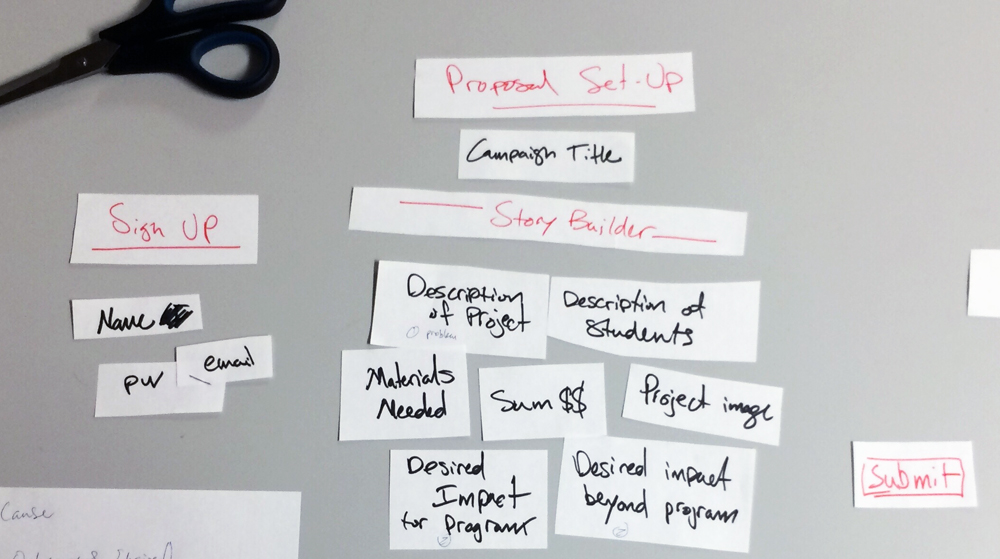
1. A "typical" flow: this was our version of how application forms typically collect information. Incidentally, this kind of sequence very closely follows the common "WHO-WHAT-WHERE-WHEN-WHY-HOW" pattern of most news stories. Click/tap to see larger version.
The "typical" flow collects information in a standard sequence:
- Sign Up:
- Password
- Name (First / Last)
- Social Accounts
- Profile Setup:
- Organization Info (phone, address, website, etc.)
- Non-Profit Status
- Profile Image
- Proposal Setup:
- Project Title
- Project Image, Project Description, Student Description
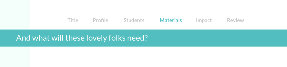
- $$, Materials Needed
- Project Video
- Impact
After collecting standard sign-up essentials, the form asks for additional information about the user and their organization. Only after multiple modules of background information, does this flow begin to address the parts of the project deemed most important by the BOD and the teachers: the students, their needs, and the objectives and assets of the campaign.
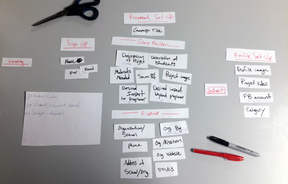
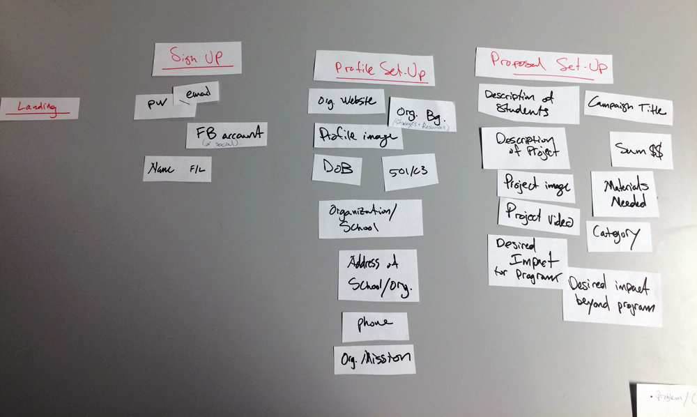
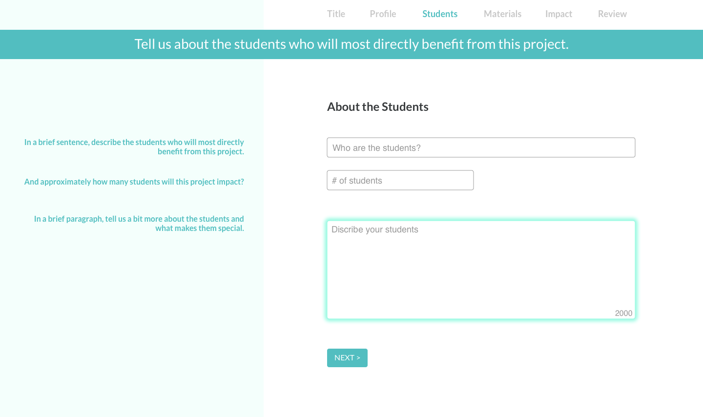
2. Story-Forward Flow: This is the most radical proposition for orienting users towards the story of their projects, with the Story Builder Section appearing almost right away. Click/tap to see larger version.
Conversely, in the "Story-Forward" flow, the Proposal stage launches right into the title, description of project and of students, followed by their needs, and desired impact.
- Sign Up:
- Name
- Password
- Proposal Setup:
- Project Title
- Project Description, Student Description
- $$, Materials Needed
- Impact
- Organization Info (phone, address, website, etc.)
- Non-Profit Status
The Story-Builder section is then followed by the Expand section, which fills-in key pieces of information that are integral to the proposal. At the end of this flow, the proposal would be submitted. Additional information would be asked for once/if the proposal is approved.
Applying the narrative framework to this sequence, students appear much more clearly as protagonists who are actively trying to overcome challenges.
While we were aware that this proposal / sign-up sequence is in many ways unconventional, and thus might give users pause, it still seemed appropriate for keeping applicants engaged in the process and helping them formulate a narrative.
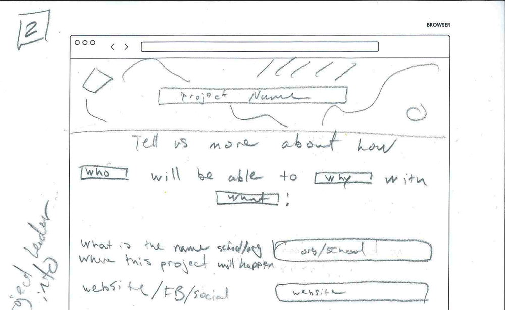
To further flesh out this story-forward content strategy to our client, we developed an annotated user flow diagram which sketches, some language around content modules, and input examples (see below). Also evident in this diagram is the emergence of the natural language ("mad-libs") feature (second box from the top), which attempts to construct and display user input as an actual narrative.
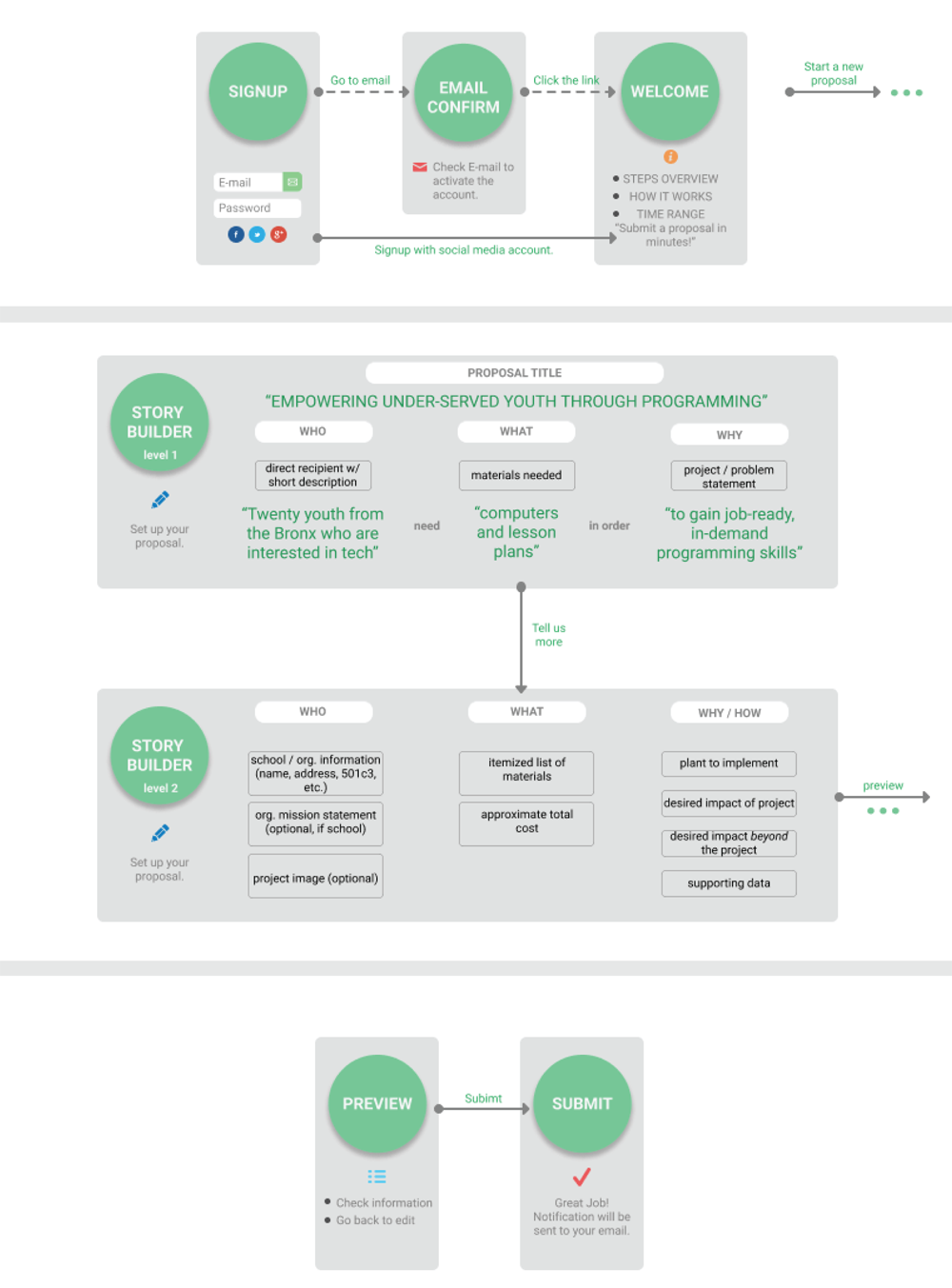
Annotated user flow diagram which sketches some language around content modules and input examples. Click/tap to see larger version.
Diagram by Ludi Dai.
Though our client and we found this mad-libs feature to be an exciting and promising advance—turning a routine form into a story that "writes itself"—without solid feedback from users, we remained skeptical about its effectiveness. Seeking the next round of in/validation about this new set of presumptions, we moved on to the development of low-fidelity prototypes and user-testing.
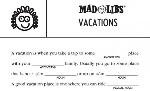
A mad-libs game card where players are asked to fill in a narrative with specific parts of speech (noun, verb, etc.). In our story-forward prototype, we ensured proper grammatical fit by phrasing the prompts in a way that properly constrained the likely answer.
With the story-forward approach appearing promising, and several presumptions still untested, we moved ahead to the development of low-fidelity prototypes.
To explore the story-forward strategy, we developed a natural language, mad-libs style form, which helped users build the story of their project.
A sketch for a form module which puts to use the "natural language" method of collecting information.
A low fidelity, natural language interactive prototype.
With the prototyping tool Atomic, we built a low fidelity, interactive prototype of the proposal submission form. The prototype applied the story-forward content strategy. The main feature of the prototype is the "mad-libs" style fill-in-the-blank collection of information.
Using plain, natural language, users are asked to describe their students, the kind of materials they would need, and the overarching goal of their project. As each piece of information is collected, the system remembers it and integrates it into the following prompt. The primary purpose of this prototype was to test the effectiveness of collecting information in this order and manner.
See the live, interactive prototype here.
5. User Testing
With several prototypes on hand - each following different content strategies and presentation styles - we moved on to user testing. Six users tested the natural language prototype (interactive) and two others (non-clickable).
A user interacting with a prototype and giving feedback.
Specifically, the prototypes would test for the following:
- Content: In what order should information about the project be collected?
- Context: Is the language being used to ask for specific information clear?
- Presentation: How do different layout densities impact users' engagement and comprehension of what's being asked?
After this round of tests, all users' comments were collected and graphically mapped back onto the prototypes giving clear visual indication of particularly problematic (or praise-worthy) features.
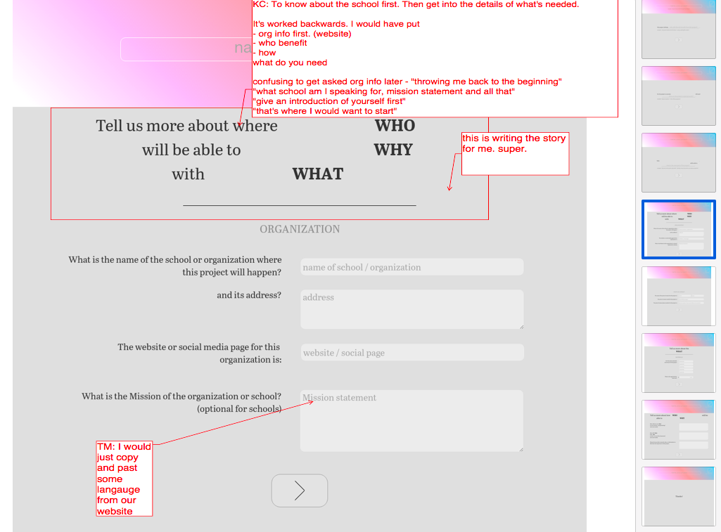
User feedback collected and mapped back onto the prototypes. This visual presentation of users' comments gave a quick and clear indication of particularly problematic (or praise-worthy) features.
Putting together all the research described in this section, as well as from other methods, we went on to identify and synthesize insights from the available data. These are summarized in the following section.
Putting all the user research together, including interviews and prototype testing we went on to identify and synthesize insights from the available data.
In general, educators:- found "story-telling" an important but difficult component
- considered students to be the most important part of fundraising projects
- appreciated content presented in natural language
Additionally, we discovered a tension between content order and content priority - an issue we did not anticipate. To resolve the tension, we decided to present content modules in a common, predictable sequence, and to use other means (layout, messaging, etc.) to appropriately indicate priority.
This led to the drafting of the Content and Language Manual.
Key Research Takeaways:
Content:- Users expect content in short, easy to understand sections, but want global overview
- educators are able communicators, comfortable with writing as necessary
- identified "storytelling" as an important but difficult component
- appreciate "preparedness" and "planning", a sense of what to expect
- committed to students, see them as most important part of fundraising projects
- BOD's main priority is community at large, long-term impact
- educators fluent in language education reform
- sensitive about students' privacy and organizational conflicts of interest
- reacted negatively to dense layouts, preferred layouts with space around content, "lighter"
- appreciated content presentation in natural language
- not very experienced with crowdfunding platforms
Presentation vs. Priority Order
Aside from these findings, particularly pertinent was feedback on the order of the content modules. While a minority of users did have a positive reaction to the story-forward sequence (see Content Strategy above), a clear majority found the unorthodox sequence disorienting and expressed a strong preference for prototypes which were sequenced more traditionally (biographical and professional information of applicant ahead of project details).
In other words, users' expectations of content presentation order and content priority order were divergent; while they valued students and social impact first, due to habit, they expected to fill out information related to these sections towards the end.

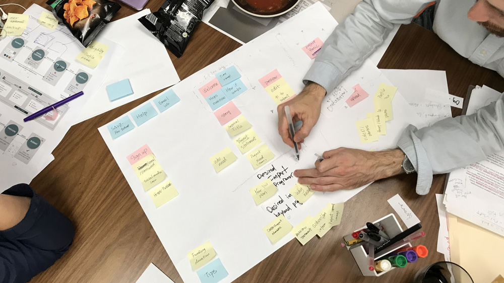
The photo above shows all collected findings arranged by presentation order. Superimposed on top of this is the content priority order which is outlined by the card and the two diamond post-its on top (click or tap to see large image).
Here, Attention Decrement Hypothesis (ADH, see Appendix) would suggest that by the time users got to the more important parts of the proposal, they would have less cognitive resources than these sections deserved.
And while ADH suggests that attention will indeed wane during an information-processing task, it also postulates that if attention is explicitly directed, it can actually be distributed more evenly throughout the task.
Bringing these user findings and psychology theory together, led us to think of presentation order and priority order along separate dimensions. We decided to present content modules in a common, predictable sequence. But, while minding what users told us was most important to their projects (helping students, sense of social mission, etc.), we knew that the form would also have to clearly reflect and support these priorities by means other than sequence.
These findings and insights prompted us to revise the inital design brief and informed the final design.
7. Design Brief, Update
With all the research synthesized into actionable insights, the initial brief now seemed incomplete. We revised the brief to reflect our findings:
- Design a standard form, making information collection easy, meaningful, and engaging.
- Help users see their project as a coherent narrative.
- Guide users through the proposal submission process, making clear what the board is looking for.
- Deliver to the board of directors a compelling and concise overview of the educator's fund-raising project and larger mission.
For each of the challenge areas, our presumptions also required significant adjustments:
Content:- [original presumption]: Users want to get through the proposal application as quickly as possible. PARTIALLY VALID
- Speed is important to users, but they also do not mind putting in time to share information that is pertinent.
- [original presumption]: The user's main objective is to obtain the materials which they are requesting in their proposal. INVALID
- For educators, materials are not the goal itself - but the means by which to help the students. Similarly, a Board member expressed that to her, material needs are secondary to the big scope impact a project would deliver.
- [original presumption]: Educators are familiar with crowdfunding platforms. MOSTLY INVALID
- Most educators are not directly experienced with crowdfunding (though NFPs are more so). I.e., there is a substantial user group that will require particular accommodation through the process.
Final design for the landing page. Click or tap to see full version.
All of the preceding research, testing, prototyping, and synthesis work, ultimately led to a design for the UI.

Final design for the proposal form. Click or tap to see full version.
The design of the proposal form has three major organizational elements, which address the three challenge areas of Content, Context, and Presentation:

The layout of the proposal form is organized according to the three challenge areas: (1) Content (2) Context, and (3) Presentation.
- Content Modules: ask users for information regarding their proposal, in easy to digest portions
- Tips: which give users additional background on the question is being asked and what would make a great answer
- Split Screen: a layout scheme, which, among other things, creates a clear relationship between essential and auxiliary information
Features: Content
Needed Information Requested Upfront - To make the proposal experience go more smoothly, the proposal landing page asks users to prepare materials they are likely to need. While this is not an uncommon feature in similar products, it is particularly relevant to educators who appreciate preparedness and don't typically have much time.

Project Title / Project Image Forward - To get users thinking about the story of their proposal right away, the form leads with prompts for the Title and banner Image. Examples are provided to give users a clear sense of what makes a good title.
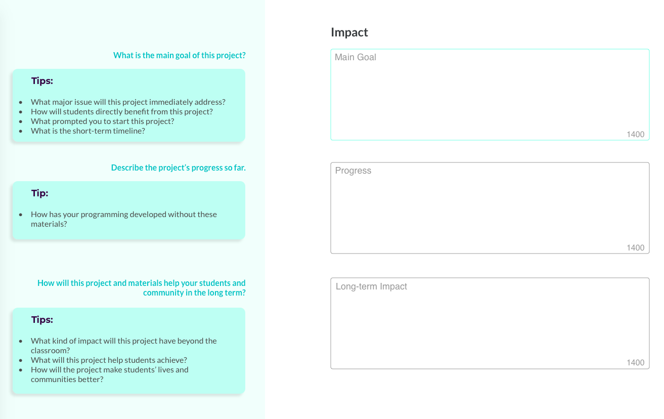
Generous Text Boxes - User testing revealed that educators are not intimidated by having to write, as long as the information being asked is relevant and not redundant. To support this expectation, in sections which are high priority order and where the responses are open-ended, we designed text-input fields which give users room to express themselves.
The size of the field on the page and the character counts give users a sense of how much information is expected, while the tips on the left give additional suggestions for the kind of information reviewers might be interested in.
Features: Context
Context-oriented features aim to let users know where they are in the overall process of an eduDAO campaign, as well as keeping a focus on what's important beyond the materials needed for the project: the students and the intended impact.
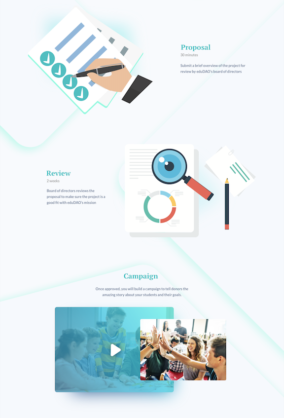
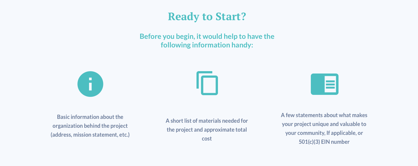
eduDAO process overview - The landing page shows the proposal section in the larger context of the eduDAO experience, giving users time estimates for each step and what to expect.
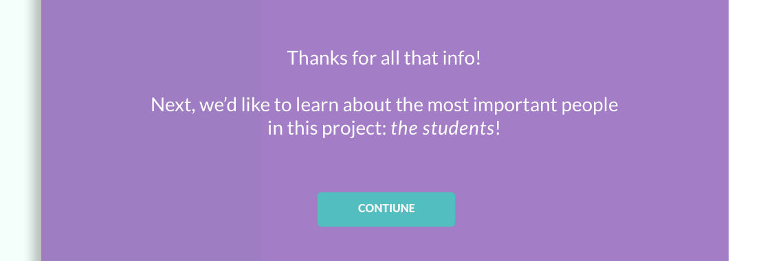
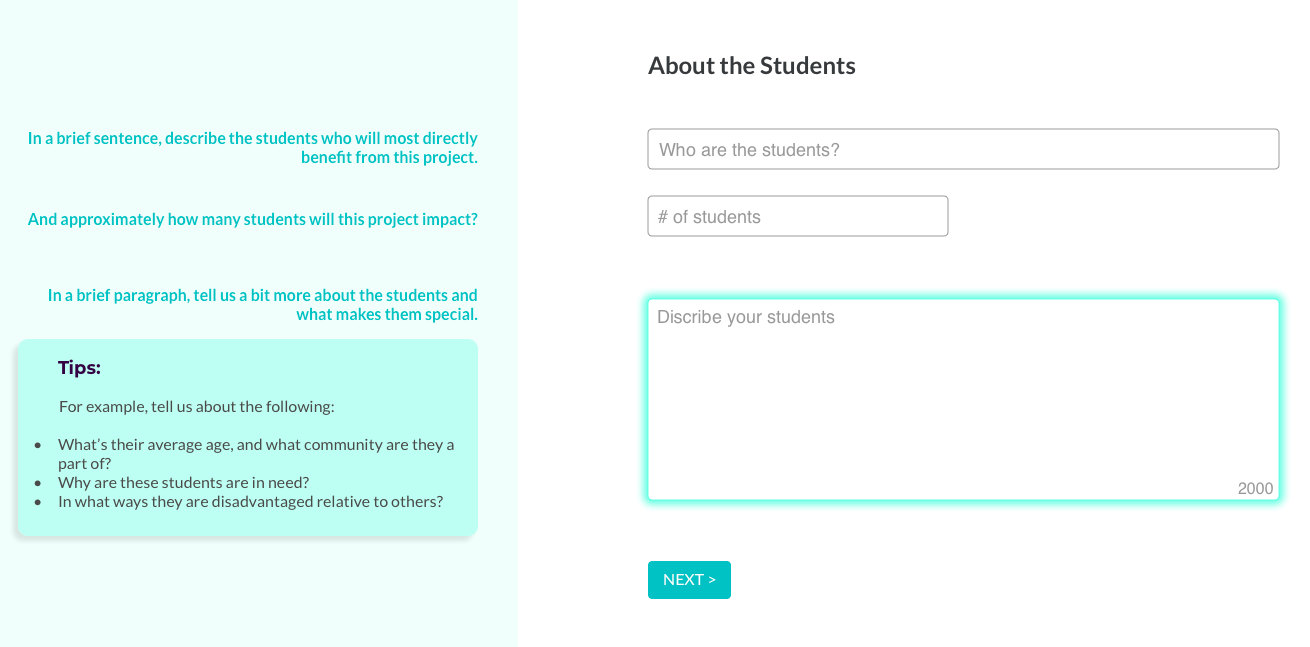
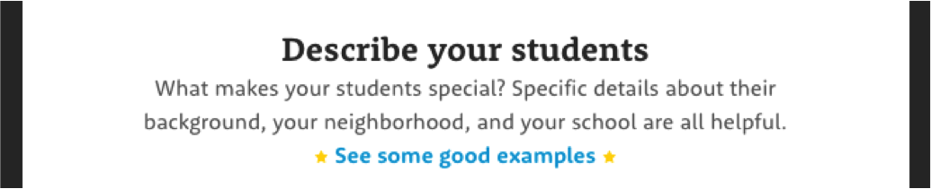
Emphasis on Students - We heard from users as well as board members that serving students should be one of the top priorities of projects. To make sure this context is understood by the user, we pre-empted the section on students with an interstitial message. Once in the section on students, users are given plenty of text-field space to describe the students, with tips providing guidance on what kind of information is being sought.
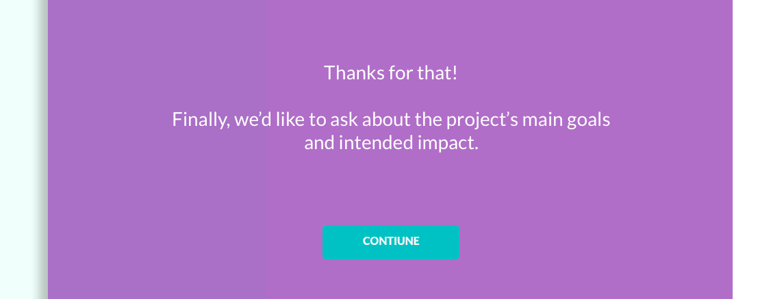
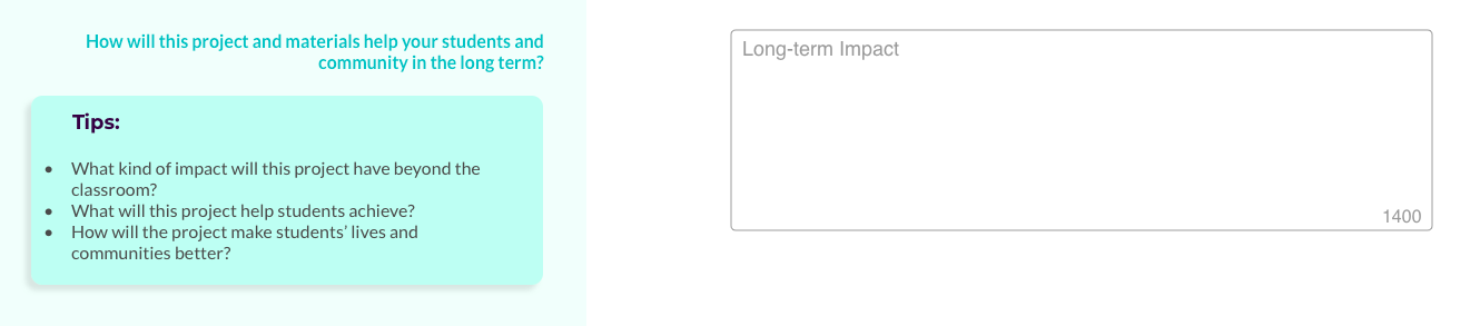
Emphasis on Impact, Big Scope - The other high priority order section is Impact and we made sure the form makes this clear. Another interstitial message sets this section up, while a separate section asking about the project's long-term impact, places the immediate needs into a broader context.
Features: Presentation
Certain features specifically address the manner or style in which information is presented to users.
Minimal, spacious layout - To make the form appear and actually be as easy as possible, we presented each content module with as few fields as possible, and made sure the graphical layout was spare and minimal. This required an iterative process between copy writing and graphic design, to pare down to the necessary essentials.

Narrative / Voice - Responding to users' interest in developing good stories, each section is preceded by a short introductory message which weaves that content module into a coherent narrative whole. The messages use Discourse Markers ("first", "next", "finally") to not only connect the sections, but also to give users a sense of where they are in the process.
To keep users engaged throughout the form, especially through the high priority sections, we developed a friendly voice that still manages to get right to the point.
Progress Indicator - To give users a visual indication of how far along they are in the proposal form, we designed a minimal progress indicator which also doubles as a navigation element to skip ahead or go back.
CONCLUSION, NEXT STEPS
After developing the above strategies and designs our team presented them to the client-stakeholders. The work was met with energy and enthusiasm, however, as of this writing - likely due to organizational or funding challenges - the client has not implemented the designs.
To move the design forward, next steps would be to let a pilot group of users go through the proposal while tracking feedback on their experience. This feedback would inform the next round of refinements. The experiences of these pilot users would set a baseline for performance.
Potential KPI's would include:
- Proposal Starts
- Drop Off %
- Proposal Success Rate
Overall, I really enjoyed working on this project. Specifically, I found it satisfying to get to know about the educator community and the kind of problems they face in their work. Speaking to them about their struggles and their experiences with online crowdfunding was imperative in gaining understanding about their painpoints, and in forming a language and content strategy that can connect with them and begin to address their problems.
Having now worked in the education space, makes me eager to take on more projects in this area.
Questions? Comments?
Get in touch!
Appendix
The following section includes additional components of the project which I either excluded from the main case study for the sake of concision, or am including here for clarification.
In the course of working on this project, with support from my team, I developed the Page-By: a method for the comparison of user flows in similar product categories. The Page-By method is useful in the background research phase of a UX project, when gaining insight into how competitors structure comparable experiences may be of value.
The goal of the method is to deliver a comparison of how a user would go "page-by-page" to achieve similar tasks on different platforms (e.g. build a crowdfunding campaign). The method is designed to provide comparisons at least at two levels of detail, with high levels of detail being easily reduced to low, but more easily presentable, levels of detail.
The method is roughly based on the spreadsheet-based competitive analysis method as described by Jaime Levy in her book UX Strategy. But rather than mapping the market with the aim of discovering competitive opportunities, this method is more focused on discovering differences and similarities in user flows, with the ultimate goal of identifying opportunities for emulation or improvement in the user's experience of the product.
The following is a very quick step-by-step guide to the method.
- COMPETITORS
Identify the relevant competitors (Jaime's book is again instructive in this regard).
- TASK
Explicitly state the Task you want the user to accomplish, including the start and end points. In our case, this went something like:
Try to formulate the task such that it can be completed with minimal branching in the flow - what's sometimes called the "happy path." This might not always be possible.
- SET UP
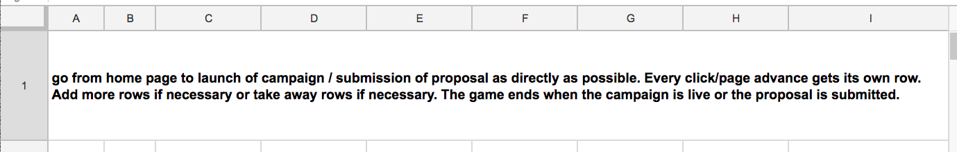
Set up your spreadsheet in the following way (adjusting as necessary for your own project).
Column Titles: PAGE COUNT, PAGE TITLE, DESCRIPTION, CONTENT, TASK, FIELDS, CTA, NOTES
Row Titles: In our case, these were LANDING, SIGN-UP, WELCOME, PROFILE SETUP, PROJECT SETUP, PROJECT LAUNCH.
These will come from the different section names of the flow that you are analyzing. Briefly look at several platforms to see how they divide and name the sections. Abstract these into generic section titles that can be used across all platforms you are analyzing. These may have to be adjusted as you delve deeper into the analysis. URL sub-directories or top-of-page progress indicators are often a good hint of how the various platforms name their sections.
It would also help tremendously to give the rows of each section a distinct background color.

Screenshot of the spreadsheet setup. Click or tap image to see full example.
- START
For each platform, start on the first page (as specified in the Task statement) and document it according to the column headings.
PAGE COUNT: keep track of how many pages you've been on. Pop-ups or warnings that require you to click-through to continue also count.
PAGE TITLE: How is the page named by the platform. Multiple pages might have the same names. Using the latter portion of the URL might also be helpful in figuring out the name of the page.
DESCRIPTION: Title aside, what is this page? What information is it trying to convey, why might this page be important, etc? Grabbing a piece of the platform's own copy, usually from the top of the page, is sometimes a quick way to "describe" the page.
CONTENT: Describe the content that you see. Is it a bunch of text telling you something? What is it telling you? Is there radio buttons? Fields? Images?
TASK: Is the task that the user is expected to accomplish on this page clear? If so, name it explicitly.
FIELDS: If there are text-fields on the page requiring user input, list the prompts for those fields.
CTA: (call to action) How does the user advance to the next page? What is the wording on the button, if any?
NOTES: Any other remarks, comments, or observations you might have about the page. Since this exercise is likely being done at the start of the project - where information collection should be broad - feel free to include thoughts on design, usability, flow, ideas worth adopting, fulfilled and unfulfilled expectations, etc.
Again, you will likely need to adjust, limit, or augment these categories as your project demands. - FINISH
Following the "happy-path" through the task, complete this survey for each page of the flow you are analyzing.
With the exercise complete for all relevant competitors (consider splitting up the work by competitor among your team-mates), you will now have a very comprehensive overview of how other platforms have taken users through a flow that's similar to the one you're developing.
- COMPARE (LO-FI)
However, the depth of this data makes comparison between platforms somewhat unwieldy. To make the data more manageable for comparison, we can momentarily mask the qualitative aspects of the data and only consider the quantitative, specifically, the number of pages in each section and in each flow.
A very quick and hands-on way to get a visual comparison of several different flows, is to print each spreadsheet out, trim them to the edge, and literally lay them side-by-side. (Before you print, you will have to make sure all the row heights in your document are set the same, and that you print each document at the same scale.)
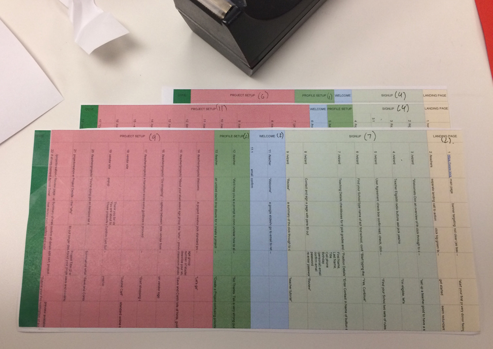
If pressed for time, a photograph of this layout, as seen above, may be sufficiently presentable to make a certain point to your teammates or stakeholders.
- COMPARE (HI-FI)
But if time permits, it is also possible to present this comparative quantitative data in much more compelling, and ultimately more insightful ways.
Platform comparisons developed with the Page-By method can be succinctly presented with graphics like the one above. While comparing flows strictly by the number of pages is in many ways limiting, it may also be useful as a quick comparative snapshot with deeper data available from the method's collection phase.
LIMITATIONS
A limitation of this method is worth noting. While the graphic presents a quickly discernible comparison between the user experience of different platforms, what's left out in the details of each page may be of high relevance to the user experience. In other words, simply comparing the number of pages it takes to get through the Profile Setup flow, for example, may not give accurate impressions of the designs. This limitation, which might be especially misleading with more polished graphic presentations, should always be disclosed. The graphic is bound to be an oversimplification that, while useful as a snapshot, also doesn't tell the whole story.
With that, next steps in refining this method would include finding ways to re-incorporate some amount of qualitative data into the quantitatively driven graphic layout. It's easy enough to imagine an interactive version of this presentation, for example, where clicking on one of the blocks representing a page leads to an actual screenshot of the page, or some pertinent insights into how that page contributes to the over all experience. This data would be captured from the initial audit of the competitor platforms, as described above.
Ultimately, in our own use of this method in the eduDAO project, we found it useful in helping us quickly grasp and analyze UX conventions in a specific product type. Additionally, because of the way the spreadsheet is laid out, abstracting these analyses into easily comparable graphic layouts is straight forward and almost immediately presentable at low or high fidelity.
On time expectation:
"Some way of letting us know what type of refinement they're looking for."
On submitting a proposal prior to the public-facing campaign:
"I would prefer a short initial application,... and [later] it would be great to have the ability to craft it and make it ours."
On presenting students' need-based status:
"'These schools are the least likely to be able to afford a robust journalism program.' That, we will not shy away from saying, either to the board or to the public."
On crowdfunding as a development strategy:
"It was a helpful stepping stone."
Attention decrement hypothesis suggests that when people are presented with an ordered series of information items (for example, a list of adjectives describing a colleague), they are more likely to be influenced by information that comes earlier in the series, than by that which comes later.
This phenomenon is commonly referred to as the primacy effect. With attention understood to be a limited cognitive resource, the primacy effect is likely caused by the gradual decrease in the availability of this resource during the information processing task. Hence, "attention decrement."
The implication here is that when let to our own devices, we will find information presented to us earlier more meaningful than that presented later.
Of course, attention is not completely beyond our control, but is actually something we can, to some extent, direct (think of what happens when you tell yourself to "focus!").
This premise is further bolstered by the fact that when people are explicitly asked to pay attention throughout an information series, they are then more likely to be influenced by later items - a phenomenon known as the recency effect.
While these outcomes (collectively known as serial-position-effects) might seem divergent, what they ultimately point to is that the order in which information is presented and the kind of attention directed to that order, both have significant implications on how we make meaning out of information series.
And that has a lot of implications for UX.
For further reading, see "cognitive load" here and "attention decrement hypothesis" here and here.